Hi!
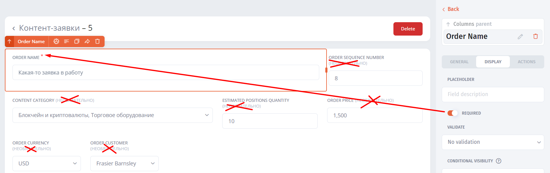
It seems to me that the “optional” hint in brackets next to the input field label is somewhat superfluous and takes up extra space, pushing the item down if there isn’t enough room. Why this was done, it’s easier, on the contrary, to display exactly the hints for the “required” field, since there may be fewer of these than the “optional” ones. And to make the designation of the required field, as considered in many cases generally accepted, in the form of a red asterisk.